


The scope
What brand work covers here
Positioning first: what the business is, who it is for, and what makes choosing it an easy decision. Then the identity that expresses it, and the system that keeps it consistent wherever it appears.
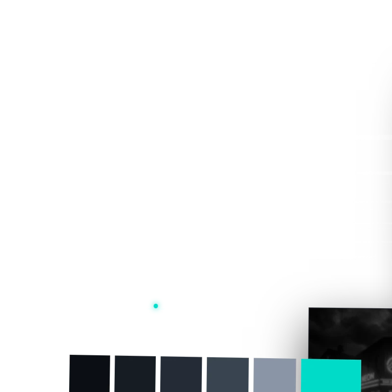
For most businesses that means a primary mark and its variants, type and colour with rules for using them, and the applied pieces that actually get used day to day.
Brand systems
What we build
A mark that works everywhere
Legible at a favicon and at signage scale, in one colour, embroidered, and on a vehicle in motion. Marks that only work in the presentation deck are the most common and most expensive mistake.
A system, not a single asset
Variants for tight spaces, clear-space rules, colour with realistic substitutes for print and embroidery, and type that a non-designer can apply without breaking it.
Dimensional treatments where they earn it
Rendered and applied versions for signage, vehicle wraps and physical presence. Useful when the brand lives in the real world, and skipped when it does not.
Explore more
- Website Design Where a new identity usually goes first.
- Our Work Identity and web work we have built.
Ready to build?
Tell us about your business, what you need and what the site has to do. We use your answers to understand the project before we talk.
Start your intakeFAQs
Do I need a new brand before a new website?
Not always. If the identity still fits the business, the site can be built on it. If the business has changed and the brand has not, doing the site first means doing it twice.
What do I actually receive?
The mark and its variants in the formats you will need, colour and type definitions, usage rules, and the applied pieces agreed at the start.
Can you work with our existing logo?
Yes. Refining and systematising an existing mark is often the right answer, particularly where there is recognition worth keeping.
How is brand work priced?
Per project, after we understand the scope. It depends on how much exists already and how many applications the identity has to cover.
Building or rebuilding a brand?
Tell us where the business is going and we will tell you what the identity needs to do.